
HTML Templates
The templating system, which uses the virtual DOM to render components intelligently and efficiently, is the power of Lightning Web Components. It is best practice to let LWC manipulate the DOM rather than writing JavaScript to do so programmatically.
You have to use a <strong><template></strong> root tag in your HTML template. You can also use nested <template> tags to work with directives.

HTML templates also render Salesforce org data to the DOM.
Nested Template
You can use a nested <template> tag with directives.
What are directives?
Directives are special HTML attributes, such as if:true and for:each, that gives you more control over the DOM in markup. You can manipulate DOM in the markup with these directives.
Nested <template> Tags can’t be used with other directives or HTML attributes than <strong>for:each</strong>, <strong>iterator:iteratorName</strong>, and <strong>if:true|false</strong>

To render HTML conditionally, add the if:true|false directive to a nested <strong><template></strong> tag that encloses the conditional content.
Data binding
Now let’s check how data binding works in the template?
In general, we bind component template properties to javascript class properties (variables).
In the HTML template, surround the property with curly braces, <strong>{<var>property</var>}</strong>
Here’s the most basic data binding example. The template’s greeting property is bound to the JavaScript class’s greeting property.


The property must be either a valid JavaScript identifier or a member expression. For example, both {user} and {user.name} are valid. Adding spaces around the property, such as { user }, is not valid HTML.
In the example below, the username and email properties are bound to the javascript variable, and whenever you change the value in the input field, it will automatically render a new value and display it on the page.
| <template> | |
| <lightning-card title="Data Binding Example" icon-name="standard:lightning_component"> | |
| <div class="slds-p-around_x-large"> | |
| <p>User Name : <span style="color: rgb(76, 0, 255);">{username}</span></p> | |
| <p>User Email : <span style="color: rgb(255, 0, 98);">{email}</span></p> | |
| <lightning-input label="Name" value={username} onchange={handleChange}></lightning-input> | |
| <br/> | |
| <lightning-input label="Email" value={email} onchange={handleChange}></lightning-input> | |
| </div> | |
| </lightning-card> | |
| </template> |
| import { LightningElement,wire } from 'lwc'; | |
| export default class DataBindingComponent extends LightningElement { | |
| username = 'SFDC Lesson'; | |
| email = 'admin@sfdclesson.com'; | |
| handleChange(event) { | |
| console.log('event: '+ event); | |
| if(event.target.label === 'Name'){ | |
| this.username = event.target.value; | |
| } | |
| if(event.target.label === 'Email'){ | |
| this.email = event.target.value; | |
| } | |
| } | |
| } |
| <?xml version="1.0" encoding="UTF-8"?> | |
| <LightningComponentBundle xmlns="http://soap.sforce.com/2006/04/metadata"> | |
| <apiVersion>55.0</apiVersion> | |
| <isExposed>true</isExposed> | |
| <targets> | |
| <target>lightning__RecordPage</target> | |
| <target>lightning__AppPage</target> | |
| <target>lightning__HomePage</target> | |
| </targets> | |
| </LightningComponentBundle> |
Use CSS to design your Lightning Web Component
Use the Lightning Design System to give your component the Lightning Experience look and feel. You can create your own CSS to go your own way.
Base components (in lightning namespace) include a class attribute that allows you to add an SLDS utility class or custom class to the component’s outer elements. To apply a margin utility class to the lightning-button base component, for example, use class=”slds-m-left medium.” It’s used here to increase the space between buttons.


Many of the base Lightning components have multiple design variations. Each design variation gives a component a unique appearance.
Custom components in Lightning Experience or the Salesforce mobile app can use Lightning Design System without any import statements or static resources. Simply add a Lightning Design System CSS class to an HTML element.
You can also use custom CSS classes to design your component.
| <template> | |
| <lightning-card title="Design with CSS" icon-name="standard:lightning_component"> | |
| <!--This class (slds-p-around_x-large) is used for padding--> | |
| <div class="slds-p-around_x-large"> | |
| <!--Custom CSS clsss (para-header-style) used to style the paragraph tag--> | |
| <p class="para-header-style"> Welcome to Lightning Web Component Tutorial</p> | |
| <!--Custom CSS clsss (para-style) used to style the paragraph tag--> | |
| <p class="para-style">Learn LWC framework from scratch with real use cases.</p> | |
| <!--Style button components using lightning design system styling hooks--> | |
| <lightning-button variant="brand" label="Click Me !" ></lightning-button> | |
| </div> | |
| </lightning-card> | |
| </template> |
Create a style sheet in the component’s folder to bundle styles with it. The style sheet and the component must have the same name. The style sheet is automatically applied to the component. Each component can have only one style sheet.
Styles defined in a component’s style sheet are component-scoped. This rule allows a component to be reused in multiple contexts while retaining its style. It also prevents the styles of a component from overriding styles in other parts of the page.
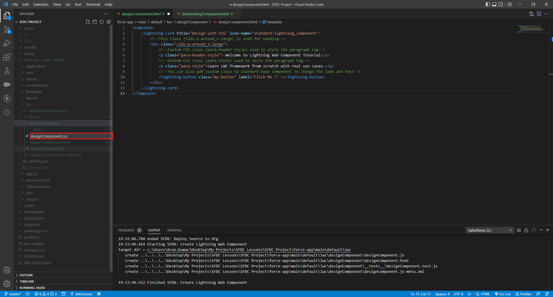
Right click on the lwc folder and select new file.
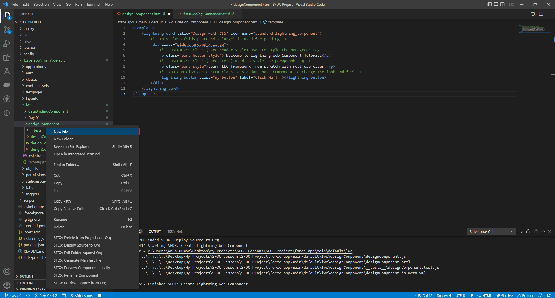
Enter file name as lightning_web_component_name.css (e.g designComponent.css)
| .para-header-style{ | |
| font-weight: bold; | |
| font-family:cursive; | |
| color: darkblue; | |
| font-size: large; | |
| } | |
| .para-style{ | |
| font-family:'Times New Roman', Times, serif; | |
| color: rgb(8, 8, 8); | |
| font-size: medium; | |
| } | |
| /* Style button components using lightning design system styling hooks */ | |
| :host { | |
| --slds-c-button-brand-color-background: purple; | |
| --slds-c-button-brand-color-border: purple; | |
| /* Other CSS custom properties here */ | |
| } |
Here’s how the component will look with a custom CSS design.


